Redesign of the retable in the 18th century

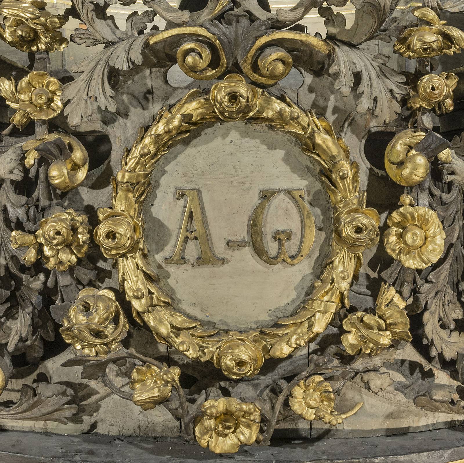
The comprehensive redesign of the retable apparently took place in the 1720s: the initials of King Charles XI of Sweden were replaced by the letters α and Ω symbolising the beginning and the end of all things. The architectural portion of the retable that was originally coloured with black and gold was coated with light tones that suited the rococo period. Additionally, Gloria, a golden sun bearing the name of God in Hebrew, was placed on the retable, and the baldachin arch was also redesigned – the wavy arch with tufts of the baldachin arch, which has hitherto been attributed to Ackermann, is secondary.
Alpha and omega are the first and last letters of the Greek alphabet, and are often used on flags, shields, books and elsewhere as a symbol of the Son of God. This is based on the Revelation of John: “I am α and Ω, the first and the last, the beginning and the end… (Rev. 13).
Gloria is the resplendent glow that manifests the supreme level of divinity. Gloria is the symbol of God the Father as the supreme Lord of the heavens and of Christ as Judge.